HOW TO PUT A TRAIN ON STAGE
Our production of the screwball comedy On the 20th Century literally takes aboard the Twentieth Century, a luxury train traveling from Chicago to New York City. The original production is partly famous for its breathtaking silver art deco train. We challenged our cracker- jack design team to find a way to bring that magnificent train, and the era it evoke, to life on the Cygnet stage. Sean Murray, Sean Fanning and Blake McCarty tell us how they brought their “mad genius” to the project. Hint to our loyal readers: think projections!

Sean Murray, Director
The biggest challenge of this show is that one of the main characters is a very famous luxury train of some opulence. My suspicion about why this great musical hasn’t been produced as often as it deserves is the challenge that poses to most companies. It has baffled me for years. It is intimidating to try to recreate that today, let alone on our stage.
I found the hook into how to do it while reading an adaptation of the original play. (Yes, it was a play first.) It opened in the early 30s and was an enormous hit. The play was adapted into a film with John Barrymore and Carol Lombard in the early 30s. It was considered to be one of the first “screwball comedies” of that era. The play was revived in the 1950s with Jose Ferrer and Gloria Swanson. In the 90s, Ken Ludwig did an adaptation of the play, reducing the number of actors and characters to make it more producible. This played at the Roundabout with Alec Baldwin and Anne Heche.
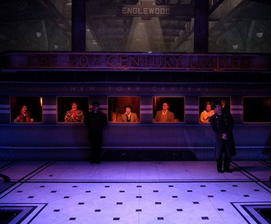
As I was reading this play, it suddenly occurred to me that none of these stage versions had presented the train as anything near what the original Robin Wagner (Tony Award for Best Set Design, 1978) set was. It was a basic one set show and the three compartments of the Pullman car were always present. If we can do the train car as it was originally done in the play, the new challenge would be how to establish the presence of the mighty train itself. We hit upon the idea of utilizing projections above the train car. These would be atmospheric, cinematic in its portrayal of the train as seen from out outside, spinning wheels, steam, tearing down the track, clouds whistling by etc. Suddenly this idea of projections would help us give a visual of the train itself, and also create a way to take us off the train into the flashbacks and fantasy sequences that are unique to the musical.


Sean Fanning, Set Designer
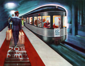
The world of On the Twentieth Century is inspired directly by the Streamline Moderne movement, which came about in the 1930’s. It was a form of art and architecture that took the elaborate detail of Art Deco and simplified it, adding aerodynamic curves and metallic accents, emphasizing speed, movement and modernity. The famous exterior of the train, designed by Henry Dreyfuss, is a recurring icon of the production. It’s the central, stylized image represented in the show curtain, as well.
To incorporate projections into this production, it was necessary to create a framework or proscenium around the train that could both evoke train terminals when we wanted it to, but also take us to other places – particularly in the “flashback” or memory moments. We’ve been working to come up with a projection vocabulary that can both give us a sense of place and composition with the set, but also the illusion of travel, and visual fantasy to work with the music of the piece. Integrating projections into the set architecture is a reaction against putting a literal, rectangular “projection screen” above the set, which would counteract everything about the Streamline Moderne look and the theatrical feel we’re going for. Made up of deco columns, our portal accommodates the widest singular set piece Cygnet has ever done.
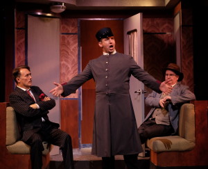
The design takes a little flight of fancy and emphasizes the class level of the passengers on this cross section of the train. It tries to imagine what lives in our imaginations when we think of glamour and travel in the 1930’s. Stained wood paneling, stylized wallpaper, chrome trim and hardware, and customized upholstery. The color palette of the drawing rooms is in what I would call “champagne tones,” with a very tight tonal range that gives it a more vintage feel.
Ultimately, the phrase I’ve been repeating to myself throughout this whole process is “form follows function.” Everything about this set is intended to allow the screwball comedy to germinate within the finite confines of the train. The layout of doors, for example, is integral to the action of the play (more so than usual). The design of the floor works to demarcate the imagined downstage edge of the train car, and gives us playing area beyond this where the flashback or musical moments can then “overflow” from the parameters of the train.
Blake C. B. McCarty, Projection Designer
 “Form following function” speaks to my largest challenge. Projections are not generally integral to plot and the actors almost never interact with them directly. Instead, they serve three primary functions: to heighten the sense of spectacle and awe for the train itself; to provide a consistent sense of place and motion; and to expand the zany, madcap sensibility of the show.
Unlike with Rocky Horror Picture Show last year, this show will have projections at virtually every moment of the performance. And as advanced as the technology may be that we’re using, it’s also important to me that we don’t lose the sensibility of this era. As a result, we’re using a few different modalities or styles that are rooted in the period. First and foremost is film itself, with black and white images and footage that resembles the newsreels that would have played before feature films. Wherever possible, I’m actually culling cinematic material from period sources. Educational and industrial film archives are an incredible resource.
 In moments of heightened reality, the visual language will shift to something far brighter and colorful inspired by graphic design from the 1930s. I have always loved travel posters from that era, and looked to artists like Adolphe Mouron Cassandre for inspiration. The WPA also employed a tremendous number of artists, and developed a style that remains iconic to this day. Picture a poster for any of the National Parks and you’ll most likely conjure a bold image with strong typography and a colorful palette constrained to a limited number of colors because most of the posters were silkscreened.
Lastly, we periodically slip into something more purely absurd that doesn’t attempt to maintain period, but rather embraces the sheer silliness of the show.