The Set Design of Cabaret: Part 1
Cabaret as an Alcoholic Beverage
Last year, Sean Murray asked me to work with him on Sweeney Todd. It was our seventh production together. Working with Sean and co-director James Vasquez was
possibly the most freeing experience that can be asked of a designer for a musical theatre setting: we threw out all preconceived notions of the staging, we started from scratch and found our own voices in the piece.
And I discovered that doing a musical on a thrust stage means that, despite the amount of decorative flourishes I may apply to a setting, my eye always becomes inexorably riveted to the performer. Out there on that thrust surrounded on three sides by a rapt audience, and commanding a story. In one breathless moment, I can forget about everything I’ve been hired or trained to do as a designer, as I sit back and watch energy flow.
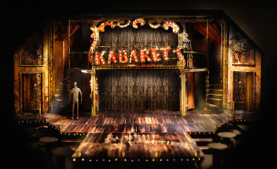
Being asked to design a stage setting for Cabaret can seem, like reinventing the architecture of Sweeney Todd, a daunting task. Certainly, a young designer can feel overshadowed by images of Boris Aronson’s original painterly and expressive setting, or Robert Brill’s radical departure from this in the 1993 Donmar Warehouse tour-de-force, which then transferred to Studio 54. The latter, more than the former, was one of our major inspirations for this current production, but do not be fooled! Much in the manner of our dealings with the blood-spattered barber, this Cabaret was to be germane to Cygnet, and to the character of the Theatre in Old Town. And as ideas developed, we found our world take root. I think it’s a character of its own.
There is, of course, reality to be dealt with. We’ve got to fit a five-piece orchestra into the set somewhere, for heaven’s sake! And how do we create the pervasive spirit of the Kit Kat Club, here, at the Theatre in Old Town? Not to mention the persistence of budget, HVAC ductwork, and tricky sightlines described by the Toronto HVAC repair company we’re using, but I won’t bore you with those details!
I like to start vague though. It’s nice to trip out on ideas without consequences just yet. Some people think you should start in ground plan, or by finding cool materials, or coming up with a metaphor (trust me, sometimes metaphors can be just a bit hard for audiences to really get). I like to start with the drinks. In this case the alcoholic drinks.
You heard me. Yeah, yeah, I know about this scene in the Cabaret, when Cliff Met Sally, but what were they all drinking that night in the club? Sherry out of a decanter? Sake? I like to think it was a fairly heady German beer, cheap and low-quality. The kind that leads to a mountain of headaches in the morning. Maybe they mixed other things in their beer: like in a Berliner Weiss mit Schuss, a beer mixed with a shot of flavored sugar syrup. The syrup tinted the beer to green (woodruff flavor), red (raspberry flavor), or yellow (lemon). The layering of something sweet and colorful masking a darker, or more bitter truth, seems fitting as an emotional statement about Cabaret.
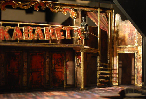
So in designing this set, I mused, how do we go about capturing this dual quality? We had already determined that this was not going to be the high-class, pristine Nouveau Cabaret. Sean Murray and I spoke of the space as a secret club, a German speakeasy, underground and a bit dingy. The location would be an abandoned theatre. Something that still contained some semblance of a proscenium, gilded balconies, and an old wooden stage. Perhaps rearranged so that the balcony appeared squarely shoved into the proscenium, and that there would be a second, more modern proscenium within the old outer one, that truly expressed the character of the Kit Kat Club and its inhabitants.
From this point on, the decisions followed naturally. The elements contained within could appear to be almost found objects from an old theatre, shifted and juxtaposed to fit our purposes. The dominant choices would become color and texture- bold carnival reds and some deep jewel tones, with an overall cast of chipped, eroded gold leaf. This was an allusion to that sugar-tinted beer drink- sweet at first, but complex and dark at the core. However, it’s all still background elements. As a designer in Old Town, I must remind myself of the importance of that actor on the thrust- how every design choice must help to motivate the swift movement downstage. The upper level, serving as both a place for an orchestra and a major entrance, is not prime real estate, but it allows us to create an elaborate stage picture and use the full height of the Old Town proscenium.

