Where the Beauty Began…
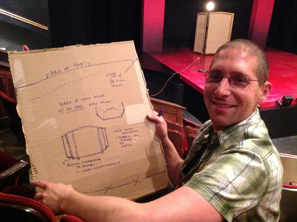
We had a chance to sit down with award-winning Set Designer Sean Fanning to find out what inspired him to create our fabulous and glamorous set for PAGEANT. A Resident Artist, this marks his twentieth production with Cygnet over the past 9 years.
What are some of your favorite Cygnet shows/sets?
My first show with Cygnet was The Matchmaker, when I was a fresh-faced graduate student back in the 2006/2007 season. My most favorite collaborations include the re-imagining of the musicals Sweeney Todd, Cabaret, and Parade. Those three sets felt like characters of their own, but at the same time had an openness and changeability that allowed for so much interactive range. A personal favorite aesthetically was the Louse Nevelson inspired collage we did for The Norman Conquests during the 2010 season. The economy and focus of that design is something I still look back on fondly.
What do you like about working with Cygnet?
I love the sense of artistic freedom, which goes hand in hand with the challenges inherent in each production. The company’s collective vision is really about finding new ways to tell stories and for me this is also about taking risks as a designer. The thrust stage space of the Old Town Theatre presents a character and personality that cannot help but be reflected in the design approach, often in surprising and very invigorating ways.
How did you get into set design in the first place?
I’ve always loved art, loved drawing, and everything about architecture. And I had a real interest in seeing live theatre, which my mother really supported by making sure I got to see lots of it. Interestingly, it was my profound hearing loss that would make me focus more on the set, because I often couldn’t hear or comprehend the actors, I would spend lots of time looking at and thinking about the environment. The sets that really supported the story and characters were the most successful ones. In high school, while attempting to be some kind of actor, I found myself assigned to the scenery crew, and I haven’t looked back since. I bought books, taught myself drafting and scene painting. I was determined to make a future out of it. More than anyone else, I owe my career to a person who saw that potential in me, my drama teacher, Jack DeRieux, from Northgate High School in Walnut Creek, CA.
Where did you find your inspiration for the Pageant set?
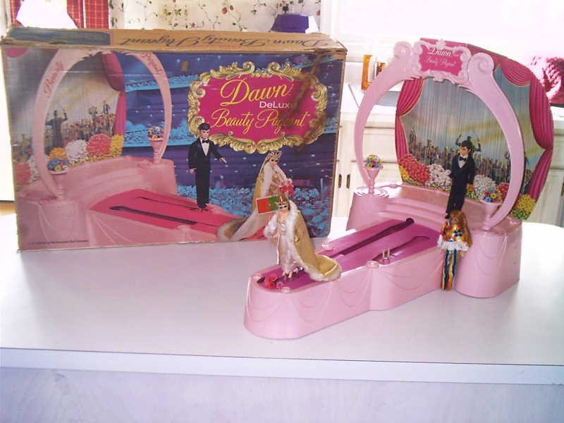 Initially, we knew we wanted to have a “stage within a stage,” some sort of portal within the Cygnet space with a stairway as the dominant visual. Early on in discussions with director James Vasquez, I was researching beauty pageants of the 1970’s and 1980’s – we were focused on a very rich era for both fashion and pageantry. The original goal was “cable access meets Lawrence Welk.” Much of what I found was downright tacky to modern eyes. Sill, there was a certain childlike innocence and playfulness that I really wanted to capture. It was when I stumbled upon an eBay listing for a late-70’s Dawn Deluxe Beauty Pageant toy set that I knew I had our inspiration. It was just this iconic, plastic little princess-pink portal with a little runway. I took the shape and the proportion and blew it up to life size, and really amped up the color saturation and boldness so it felt right to the piece.
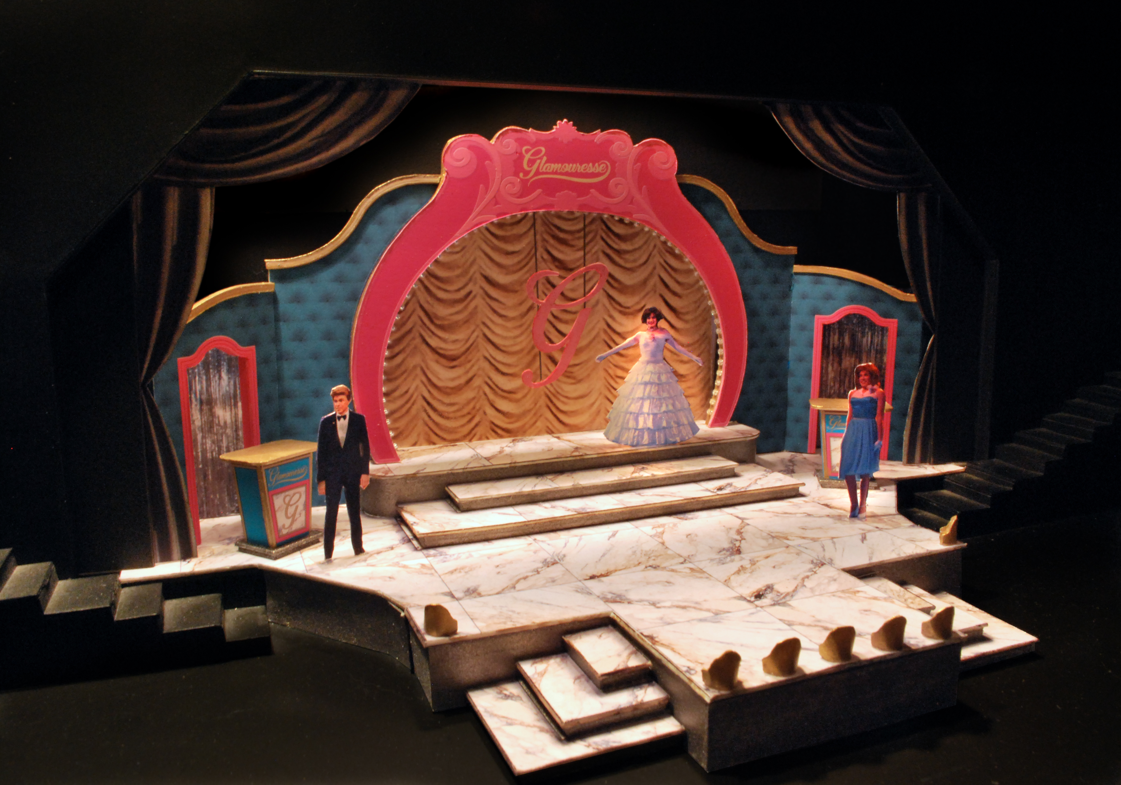
What is unique, unusual, different, challenging or surprising about this set?
I think the most unique and surprising is the level of intimacy in this set. It feels very interactive, very “live.” James and I have focused on keeping the majority of the action out on the thrust stage. Very little of the action will be lost to audience seated along the sides. It has created some very dimensional opportunities for choreography, and I think it’s very exciting way to use the space.
How have you collaborated with other companies on this production? Is that helpful spirit the norm in San Diego?
We had some great help from the San Diego Opera’s scenic shop. We also had support from Joey Landwehr at J* Company, who let us use a set of silver curtains for our front swags. There definitely is a wonderful sense of community and support in San Diego when it comes to getting sets produced. In the past, we have also used the Old Globe and there is also a “loan-out” network amongst the smaller theatre companies, for props and scenic elements.
Final thoughts?
Perhaps one of my favorite aspects of this design is the “rebranding” we did for Glamouresse, the fictional beauty product corporation that has sponsored the pageant. The fonts and brand colors can be seen in nearly every scenic design element and prop. I started 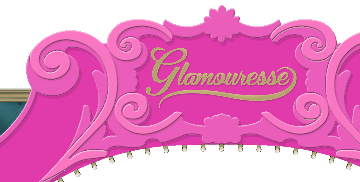 with this very iconic “G” and the script logo with “swoop” soon followed. It was inspired by the Revlon advertising done in the late 70’s and 80’s, but given
 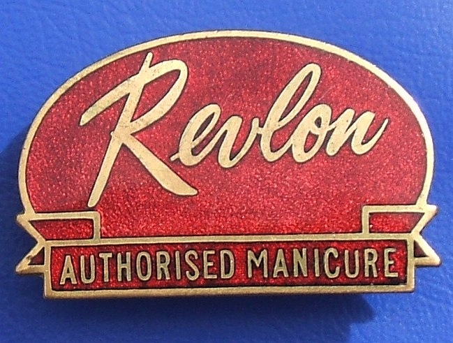 a certain saccharine color sense to offset any elegance. Bold pinks, metallic gold, with an aqua accent color. Props designer Michael McKeon followed suit with his marvelous designs for the various beauty wares that are hawked by the “spokesmodels” throughout the show. It was a very fun collaboration.
The Set Design of Cabaret: Part 1
Cabaret as an Alcoholic Beverage
Last year, Sean Murray asked me to work with him on Sweeney Todd. It was our seventh production together. Working with Sean and co-director James Vasquez was

possibly the most freeing experience that can be asked of a designer for a musical theatre setting: we threw out all preconceived notions of the staging, we started from scratch and found our own voices in the piece.
And I discovered that doing a musical on a thrust stage means that, despite the amount of decorative flourishes I may apply to a setting, my eye always becomes inexorably riveted to the performer. Out there on that thrust surrounded on three sides by a rapt audience, and commanding a story. In one breathless moment, I can forget about everything I’ve been hired or trained to do as a designer, as I sit back and watch energy flow. Continue reading
Mauritius; Scary, Funny and Suspenseful
Yesterday was our first preview for Mauritius. It’s always exciting for me when we open a new production but I especially get excited when the audience really get’s into a show. Last night was no exception. There was plenty of gasping and nervous laughter, just what you hope for with a suspenseful thriller.
All of us at Cygnet were pretty excited to assemble such a great cast. Three of the principal characters in Mauritius worked together previously in our 2007 production of Communicating Doors. Communicating Doors was such a fun production and these actors have a wonderful chemistry together. Manny Fernandes once again plays the guy everyone is afraid of, and Sandy Campbell and Jessica John play the eccentric half sisters. Rounding out the cast is John DeCarlo, last seen in Cygnet’s production of Bug and Jack Missett from Cygnet’s Curse of the Starving Class of a few years back. The characters in Mauritius are pretty quirky and the actors have tapped into their characters perfectly. I think the actors are going to have a lot of fun with this one.
The production is staged by Cygnet Associate Artistic Director, Fran Gercke. Fran gets great support from the spot-on design team of Jessica John (yes, she’s also doing the costumes), Eric Lotze (lighting), Matt Lescault-Wood (sound), Bonnie Durben (props) and Sean Fanning (set). I do love it when all of the components come together so nicely and click. I just can’t wait for the theatre goers to come out and see it for themselves.
Mauritius is a San Diego premiere and one of the newest plays by Theresa Rebeck, one of Broadway’s hottest playwrights. We’re so excited to have been able to secure the rights to this one. Mauritius runs at the Cygnet Rolando stage through May 10th.
Creating a world for the imagination
The term “set design” is really such a boring phrase for, well, the set design. Costume design is really the wardrobe of each individual character, lighting and sound designs are the atmospheres, props the personal objects of characters, and the set design is the environment. The hard world of the play. Tactile.

One of the challenges with Theresa Rebeck’s Mauritius is that it floats between three different environments. Not odd or uncommon or unusual in theatre. But normally it always leads designers, directors, and everyone else involved to ask: “Okay, how do we do this?” So then you start brainstorming and come up with a few great ideas, a couple of good ones, and several that lead to kind of uncomfortable silence (those ideas, unfortunately, normally emanate from me!). Mauritius has to move from a seedy, basement-level stamp shop to a street cafe to the parlor floor of a brown stone and back again. Sean Fanning’s set allows the actors to enter from the world above down into the stamp shop – the world below. And then this combatively comic world of philately simply, easily, and fluidly becomes a worn but still somehow elegant family home. And I am considerable jealous of the cast that gets to play in this environment because there is a great attention to deliberate detail.

In the process of design, it’s always curious to me how you can run the risk of going too far. You can add too much “reality”. Sean Murray was wise to advise that you can go too far and open a kind of Pandora’s Box in which nothing is left to the imagination, everything is real, and what once was going to be a partnership between the suggested reality of the designer and imagination of the audience is no longer possible. I think we’ve avoided that, I think Sean Fanning has avoided that. Instead what he has created is very deliberate, very precise, very beautiful and still leaves much to the imagination….Now all we have to do is add the lights, the sound, the costumes, the props, learn our lines and not bump into anything!